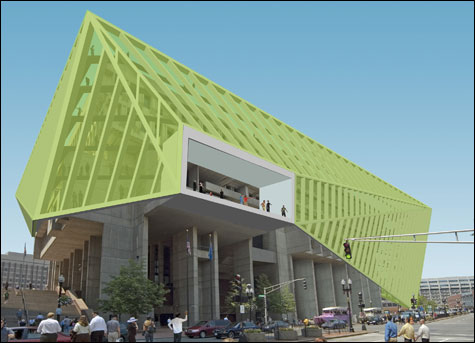
CHANGING WITH THE TIMES? Höweler + Yoon proposes wrapping City Hall to create new public
spaces that will connect it to the plaza below.
|
|
“Design Life Now” | Institute of Contemporary Art, 100 Northern Ave, Boston | Through January 6 | “Rethinking Boston City Hall” | Pinkcomma Gallery, 81b Wareham St, Boston | Through October 26
|
Two new exhibits take design — the familiar background of our daily lives — and give it immediacy in a gallery setting. Hovering above the waterfront at the ICA, “Design Life Now” is a polished production that overviews the new and flashy. “ReThinking Boston City Hall,” at the subterranean Pinkcomma Gallery, offers some insight into the renewal of the old and unfashionable.
“Design Life Now” originated at the Smithsonian-Cooper Hewitt National Design Museum in New York last winter, the third in the museum’s triennial series, following “Design Culture Now” in 2000 and “Inside Design Now” in 2003. The shows have always been a bit of grab bag, but against the backdrop of the Cooper Hewitt’s intimately scaled interiors and 19th-century ornamentation, the up-to-the-moment works have cohered as a statement about modern sensibilities. This one is the first to make its way out of New York (it travels to Houston in January), and it’s been redesigned for the ICA’s white-box galleries. Architect and Harvard Design School professor Michael Meredith has built out the space with a series of thick parallel plaster walls inspired both by the rows of industrial shelving at big-box discounters and by the streets, alleys, doorways, and windows of traditional urban centers. Openings channel movement through the exhibition and past individual objects framed by recesses carved into the plaster.
At its best, the exhibit re-examines the unity of form and function that’s the hallmark of great design. The more familiar objects on display include everything from Nike sneakers and the iPod Nano to Thom Browne’s men’s suits. In the realm of domestic design, ReadyMade magazine upends ideas of fine furnishing. Recycled soda crates become drawers in a storage unit whose shell is made of cut-out plywood; a chandelier is made from chopped-off water bottles stuffed with electric lightbulbs. Chip Kidd’s book covers compress literary narratives into visual images — the jacket for Jay McInerney’s The Good Life shows plates, forks, and spoons covered with what we recognize as World Trade Center dust. Even the most familiar objects reach out and grab you with their takes on the tried and true. The humble prescription pill bottle of Deborah Adler and Klaus Rosburg is color-coded and shaped for easy reading in such an intuitively obvious way, you want to kick yourself for not inventing it first.
The exhibit is less successful when the works require explanation. iRobot’s Roomba and Scooba may be well designed, but here they are forms with no clear functions. Why not turn these futuristic cleaning appliances on and let them loose so we can see them in action? Or better yet, slice them open and peel off their skins so we can watch the gears going round. Boeing’s new Dreamliner widebody jet may be a radical departure from the typical airplane, but the photos on the wall and tacked-on text don’t make the case. Let us sit on a seat, electronically dim the windows, or take a virtual trip. Interactivity might provide a “Eureka!” understanding.
Architecture and landscape design also suffer in this tightly controlled environment. Preston Scott Cohen’s design for the Tel Aviv Museum of Art is based on an ingenious system for distorting space to provide a compelling exhibition environment, but the relationship of the complex interiors and shell-like exterior is never clearly articulated. Field Operations is a firm that operates at the confluence of landscape architecture, urban redevelopment, and ecological investigation in projects like the renewal of Manhattan’s abandoned High Line elevated railroad (with ICA architects Diller Scofidio + Renfro) and the Fresh Kills landfill on Staten Island. Yet the ideas that motivate their work don’t come through in the otherwise seductive graphics.
The exhibit’s organization doesn’t promote an understanding of the cross-disciplinary nature of so much of this work, isolating architecture, fashion, furniture, and graphics into their own areas rather than grouping them by their generating ideas or similarities in form or structure. Neither does it say much about design for anyone outside the developed world, with the exception of Architecture for Humanity’s emergency shelters and community facilities. “Design Life Now” may be gorgeous to look at and fun to explore, but it’s not particularly profound.
Buried in a South End basement at Pinkcomma Gallery is a much smaller exhibit that addresses critical urban issues with thought-provoking ingenuity. Five young, local architectural firms rethink Boston City Hall and confront the broader question of how to transform cities and public spaces. ArchitectureBoston magazine commissioned the proposals in response to the mayor’s vow to sell off City Hall, after decades of neglect, and create a waterfront monument to his reign.