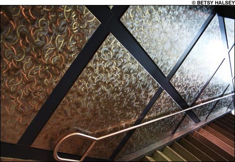
THE SILVER LINE: might be considered the runt of Boston’s public-transportation litter, but its art — including the clean, modern designs at Courthouse station (seen above) — represents some of the T’s best. |
Next time a smirking subway conductor cackles wickedly while closing the folding doors in your face, don’t get angry. Take a deep breath. Look around. And drink in the calming beauty of the art that surrounds you. Say what you will about the powers that be at the MBTA, but at least they’re trying, dammit. Trying to palliate your grubby, soul-crushing commute with the airy enlightenment of aesthetic self-expression. Since the first bristles were swept across the craggy ceilings of Lascaux, man has aspired to elevate his better nature via the creation of visual art. And so the MBTA seeks to enliven its dark and musty tunnels with dozens of sculptures, installations, mosaics, and wall hangings — objets d’art, it is hoped, that will increase the enjoyment, however slightly, of a journey that’s often less than pleasant.Some of it is conceptually and aesthetically worthwhile. Some of it is execrably bad. Some of it is laughably out of date. And some of it is entirely unintentional.
As it happens, KENMORE Station has a little bit of the first three. “Do not confuse with the beautiful what other periods called the beautiful,” once wrote French Romantic painter Eugène Delacroix. “Go further: be bold enough in almost every case to say that what was the beautiful thirty or forty years ago is now the ugly.” He’s got a point. Just look at the high-contrast enameled eyesores that pass for art in the bowels of Kenmore Station. They may have been trendy when unveiled in the late ’60s/early ’70s, but it’s doubtful they were considered especially beautiful, even then.
And their datedness is all the more apparent now that the MBTA has spent three years — and counting — and $31 million to renovate Kenmore Station, and especially when compared with the gleaming behemoth above ground: DiMella Shaffer’s handsome bus depot, a structure that looks like the shiny spine and rib cage of some unearthed futuristic fossil. (Thankfully, the ragged plastic wrapping that hung from the thing for many months like unsightly flayed skin has finally been stripped off.)
But new is not always better. In the under-reconstruction ARLINGTON Station, for instance, the abraded walls show through with mosaic signs from the early part of the 20th century, imparting a sort of wistful nostalgia for simpler times. Meanwhile, in the AQUARIUM Station, which underwent massive renovations in 2004, its tile walls — slashed haphazardly with geometric swathes of black, dotted here and there with a soupçon of pink or blue — are not very pretty. It’s unclear whether the MBTA-hired tiler meant to emulate Mondrian, say, or Van der Leck. Either way, to these eyes, they’re garish and grating.
Much more successful are the new Silver Line stations, such as COURTHOUSE and WORLD TRADE CENTER — both, perhaps not coincidentally, stops that offer close access to the Institute of Contemporary Art. The former is a glimmering edifice of crisp and clean modernity, its walls bedecked with an orderly matrix of scintillating, distressed steel plates. The latter, with a subtle nod to its seaside location, is decorated with minimalist wave-like ripples of hole-pocked metal.
Elsewhere on the lines, the mood is ancient, not modern. In the lower level of PARK STREET, a wood-carved hand is hung above the Red Line tunnel, extending two fingers in wordless blessing — it’s as if it was plucked from some saintly statue in Reims or Notre Dame. And upstairs is a mosaic worthy of Byzantine gems like the Hagia Sophia — a detailed tableau depicting the creation of the first subway station, spangled with fossilized tools, its deep tunnels hinting at mystery.